
The Elevator Wasn’t Just for Him

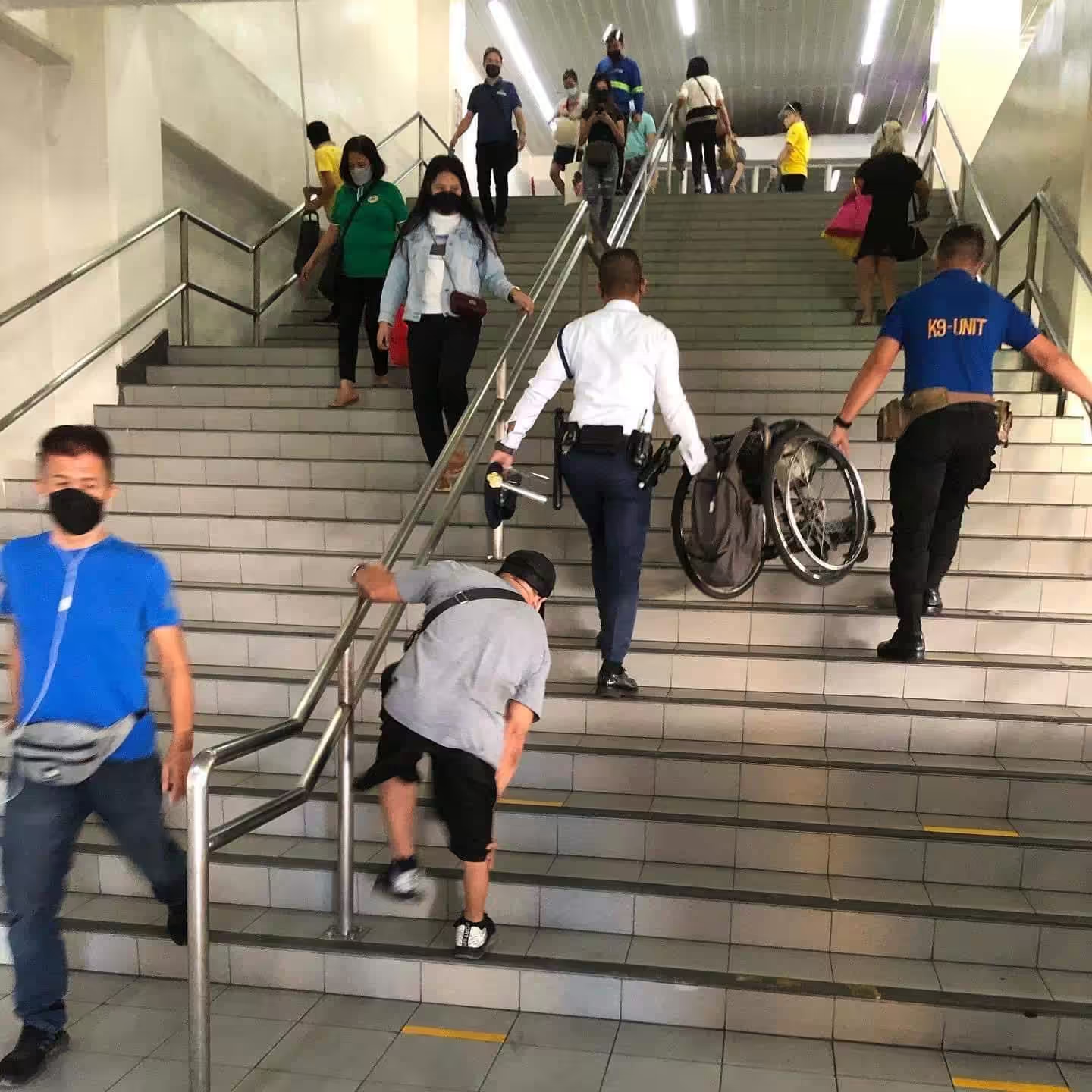
A few years ago, a photo went viral: a man in a wheelchair climbing the stairs at Recto Station, on his own, while two staff members carried his empty wheelchair up ahead of him. The elevator was broken. Again.
LRTA apologized. Promised repairs. The story moved on, the way these stories do here, until the next viral photo of the next broken elevator at the next station.
Around the same time, Rappler did something most of us never bother to do: they walked through all 46 train stations in Metro Manila and checked what actually worked. The result? Roughly 80 percent of those stations weren’t fully accessible. Blocked ramps. Locked accessible toilets. Ticket machines nobody with a visual or mobility impairment could use without help. Missing elevators, or elevators that existed but didn’t, in any meaningful sense, work.
Here’s the part that gets missed in stories like these: that elevator was never just for him.
Picture everyone else who uses it on a normal commute. The lola going up to the platform with grocery bags. The dad with a stroller and a toddler refusing to hold his hand. The guy with a sprained ankle from a basketball game last weekend. The OFW dragging two balikbayan boxes toward the train. None of them are the “target user” the elevator was built for, and all of them need it anyway.
This is sometimes called the curb-cut effect, named after the small ramps cut into sidewalks so wheelchairs can roll from the curb to the street. They were built for one group. It turns out everyone with a stroller, a bike, a rolling suitcase, or a bad knee uses them constantly, often without a single thought. Good design rarely stays “for” the people it was built for. It just becomes the design.
Now take that same idea off the street and put it on your phone.
I’m blind, so every day, software reads my phone and computer screens out loud to me, the same way your eyes scan a page. When something is built with that in mind, it just works. Buttons say what they do. A photo that’s actually carrying information comes with a few words describing it. The page is laid out in a way that makes sense if you’re moving through it by sound instead of sight.
When it isn’t built that way, even small things become a maze. A button that just says “click here,” over and over, with no clue what it actually does. A photo standing in for text I genuinely need, with nothing said about it at all. A page that feels like walking into a building with no signs, no room numbers, nothing telling you where you are.
And here’s the part that’s easy to miss: those same fixes help a lot of people who aren’t blind at all. Someone using voice commands because their hands are full at the sari-sari store. Someone trying to read a screen in direct sunlight, or with a cracked phone, who relies on a bigger, clearer button instead of a tiny icon. Someone on a slow connection in the province, watching a page load piece by piece, where the words tell you what’s coming before the picture does.
All of this sounds great as a principle. The real test is whether it shows up in practice, and that’s where things tend to fall apart.
Take eGov PH, the government’s big push to put hundreds of services into one app. On paper, it’s a great idea: one place for almost everything instead of a dozen different offices and websites. I’ve used it. It does bundle a lot together. What it doesn’t do, at least not yet, is work well with the kind of software I rely on. So for me, having a thousand services in one app doesn’t mean a thousand services I can actually use. It’s a bigger building, with the same confusing hallways.
The rules that are supposed to prevent this already exist, on paper. Government websites are technically required to be accessible. But like a lot of things written down a while ago, the rules haven’t really kept pace with what apps and websites look like now, and almost nobody’s checking whether they’re actually being followed. The gap between “written down” and “actually working” is the same gap we just walked through at Recto Station.
So here’s a small question worth carrying around this month, whether you’re writing a caption, sending a message, or posting something online: if someone going through this by sound instead of sight, or someone with their hands full and one eye on a jeepney, had to get through it, would it still make sense?
If the answer’s yes, you’ve probably just made something better for everyone else too. That’s not charity. That’s just good design, working the way it’s supposed to.